First, spoiler alert – there is no perfect healthcare system. Every system has pros and cons, and if you don’t believe us, maybe you would consider the conclusions reached by the Organisation for Economic Cooperation and Development (OECD) in their report, “Health Care Systems: Getting More Value for Money”:
- “There is no health care system that performs systematically better in delivering cost-effective healthcare.”
- “It may thus be less the type of system that matters but rather how it is managed.”
- “Both market-based and more centralized command-and-control systems show strengths and weaknesses.”
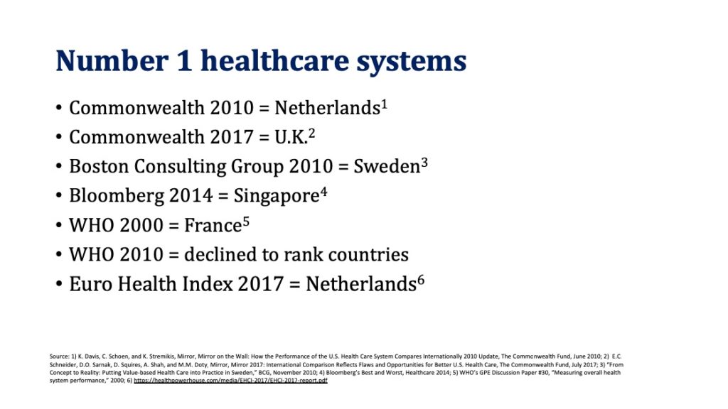
Nevertheless, we continue to see healthcare systems rankings in the media, with the US consistently at the bottom, while the system ranked best changes depending on whom you ask, what you ask, and what measures you use.
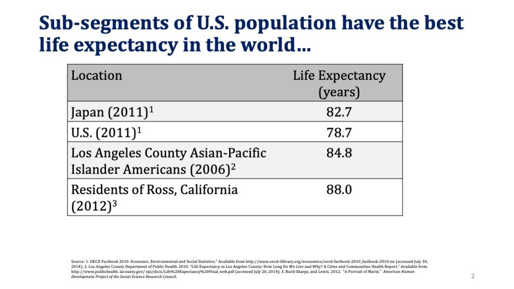
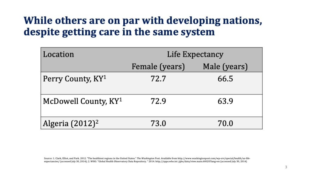
If you were trying to rank a country’s healthcare system, what criteria would you use? We often hear that the US system is terrible because we spend a lot (which we do), but our life expectancy is not commensurate with the spending. But is life expectancy a good measure of the healthcare delivery system? The US is a big country with a diverse population and when we look more closely, what we find is that sub-segments of the US population have the best life expectancy in the world, while others are on par with developing nations, despite getting care in the same system.
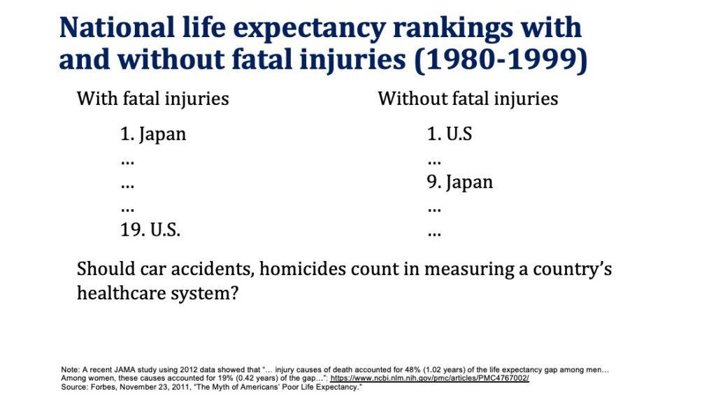
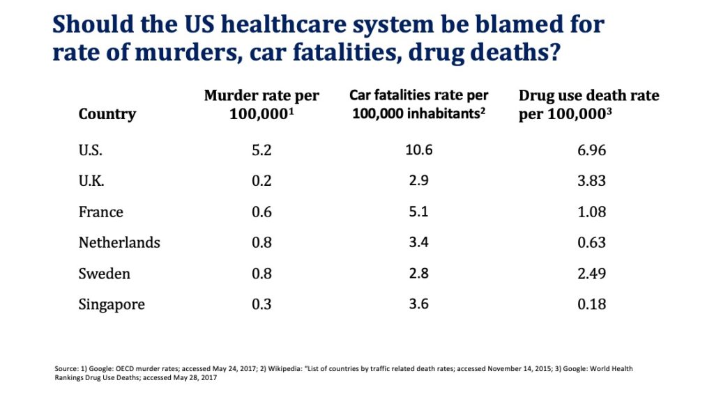
Moreover, if fatal injuries are excluded from life expectancy calculations, US life expectancy rises to the top. Should we really hold the healthcare system accountable for murders, car fatalities, and drug deaths (although the healthcare system bears significant responsibility for the recent opioid related epidemic)?
Some of the reasons for why higher US healthcare spending does not translate to higher life expectancy include:
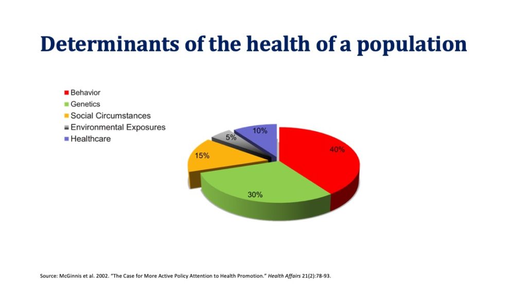
- Focus on acute care, rather than measures to address lifestyle, environmental, and social circumstances that have a much greater impact on overall population health than health care delivery. Moreover, as we have discussed previously, the money spent on these social determinants of health isn’t generating a good return on investment.
- High use rate of expensive diagnostics (e.g., CT, MRI) and interventions (e.g., C-sections, knee replacements), that again have limited impact on life expectancy.
Thus, we would argue that life expectancy is a poor measure of the healthcare delivery system, since it depends on many additional factors beyond healthcare delivery.
So, if not life expectancy, what can we use for comparison? We feel that mortality amenable to healthcare is a better measure of the healthcare delivery system and especially so, when applied judiciously. What do we mean by that? Again, taking into consideration that the US is a large and diverse country, it makes more sense to compare for example MN and WI with Sweden (MN and WI population = 11.3M vs. 9.5M for Sweden). Mortality amenable to healthcare in MN = 54.7 (best in the world), in WI = 69.4, and in Sweden = 69 (top 10 in the world).
So, what does mortality amenable to healthcare look like for the US as a whole? Once again we find that some segments of the US populations have access to the best healthcare in the world, while others fall significantly far behind. In fact, the top five states in the United States consistently rank among the best OECD nations, while the bottom five states trail all of OECD. Perhaps, when it comes to healthcare quality, we may be better served by within-US, rather than international comparisons, and strive to learn from those providers who are consistently able to deliver high-value care within the context and constraints of the current US healthcare system.
That said, there are still opportunities for the US as a whole to learn from other nations, for example along the following dimensions:
- Universal coverage is a very good goal and there are multiple ways to get there. UK, Netherlands, and Singapore are three good examples of that. All have universal coverage, but very different ways to get there, using the approach that takes into consideration each country’s culture. For example, Netherlands offers choice of private insurance plans and gets to universal coverage by imposing significant penalties for not having insurance (130 percent of the premium over the period of being uninsured).
- Value-based evaluation of new diagnostics and interventions. The UK analyzes expensive new drugs and technologies for both outcomes and cost per patient through The National Institute for Health and Care Excellence (NICE). If we are seriously concerned about healthcare costs, these analyses are important.
- Cost and patient outcomes transparency. The website of the Singapore Ministry of Health publishes data on average hospital bills for common conditions/procedures. Patients have access to information on the costs of specific surgeries and diagnostic procedures, by insurance and ward type.
In conclusion, we once again agree with the position of the OECD, “Policy makers should…adopt best practices from many different health care systems that exist in the OECD and tailor them to suit actual circumstances.”
This is so incredibly sensible and rational. That’s another way of saying I agree with everything you have written 🙂 I hope it gets a wide distribution!
Critics of the US health system oversimplify to make their political point. Who knew it could be this complicated? Answer: Any serious analyst who is willing to dig into the numbers. OECD is correct that how the system is managed really matters. Your analysis shows that demographics, location, and other factors that are not caused by the health system may matter even more.
What I most have missed, most have longed for — a comparison of the US with others across the globe which is sophisticated and avoids the conventional errors of many rankings. Your study is wonderfully subtle and, in the end, deeply persuasive. Thank you.
Thank you for another prescient look at the issue that draws so much discussion by self serving politicians. Would that such data be in the hands of our governmental policy makers.